This blog is to display my journey through a year of foundation art & design. I'm currently doing the foundation degree at Chesterfield College and these posts all show my exploration, research, ideas and more.

Explore

My photo
I'm Toni. I'm 18. Art Student.

Tuesday, 23 October 2012

Photography

Francesca Woodman

Francesca Woodman is the second photographer I decided to look at from the 50 photographers list. Most of her work is black and white photos of herself and female models. They are often blurry and quite obscure and I really was just very intrigued by her work and really wanted to look more into it. 


There is something really eery and ghost-like about a lot of her photos. How she often obscures the face gives these bodies a lack of identity. The composition of this above one is really nice, how she's taken it from the top of a stair and incorporated a reflection from the mirror at the bottom. Theres a real enigma to the photo. The blurriness of the figure has created a movement in the image, as if she's falling/fell/been pushed down the steps. It's quite a violent image. The cracked mirror, the brawled figure and the grungey stained walls.


I really like this one. How it's really captured the movement. The blurring of the figure and the garment. How the clothing the figure is wearing, even though you can't see it appears quite white and crisp, it contrasts nicely with the dirty wall behind. The floor is really dark and grimy but the figure looks free, let loose. I think it really is a nice image. It's distorted just enough, it's still clear that this is a female figure and you can still make out the dress she's wearing.


This one is also really quite a nice one. It's subtle. How the figure is semi in the water and semi intertwined with the roots of the tree. It's as if she is one with the ground. She's part of the nature surrounding her. 

Monday, 22 October 2012

Photography

Idris Khan

For contextual studies for photography we were shown a PowerPoint of 50 photographers and had to pick 3 in which we wanted to have a look at in detail. Idris Khan was the one that struck me as most interesting. I think it's the general use of layering that I thought looked really effective and have always found appealing when it comes to photo distortion. 

The Houses of Parliament London 2012

I'm also a bit of a sucker for black and white photography, so it's no wonder I found this photographer of interest.  This above photo I particularly liked. He apparently used 70-100 different images, different fragments of the image. His sources ranged from photographs, to stock images and postcards. I think it looks really effective, the different opacity's and layers. It urges you to look closer into the photo.  I also like even though the image looks really distorted you can still see what building is. It is still recognisable, which shows he's been very selective with which bits of the building he's chosen to repeat and how he's layered it. He's been careful not to alter the essence of the building and the surrounding area. 
I also thing there is something about the image that makes me think of time and change. From researching this work some of the photos used were from the 1930s and I presume others were contemporary. Which I think draws on this theme of change and the passing of time. 


The London Eye London 2012

I also think it's genuinely really interesting to see a photographer whose primary material is software. Often it's just a tool used to alter photos slightly but for Idris Khan software is essential for making he's artwork. I think this is interesting, as fairly often photo manipulation can be something that is kind of frowned upon, and seen as a 'cheat', when really so much can be achieved with it and his work is a great example of that. This London eye one I really find quite mesmerising. The way the different layered images of the eye are from deifferent angles and prespectives is really interesting and again really gives the idea of movement. It works really well for this one because the eye is a moving structure and this effect nicely gives an impression of movement.


A Memory of Being Watched 24/7


This one above is of street cameras. Hence the title "A Memory of Being Watched" apparently the cameras that Idris has to pass on is way to work every day. I really like this image as almost as if you can see rays of light like spotlights coming from the cluster of cameras in the middle. Plus you feel like your looking up at the cameras from a low angle, and with the vertical brick wall that is also visible within in image it really makes you feel looked down on. As if something is watching you from all angles.

Week 7 PHOTOGRAPHY

Photography Week 6.

We started the week using a film camera (Pentax K1000) which we used the studio to take portrait photos of each other using external flash. Whilst we were taking portrait photos of someone else the other members of our group were asking questions to try and get a reaction and capture it with the camera. It was great to be able to get practical straight away and start using the equipment. After taking the photos we learnt how to develop our photos in the dark room. 
We also had a go at photograms. Using random objects such as glass pattern bowls, lace, bottles, light bulbs ect. on photo paper and exposing it to light. We then used the developing liquids to develop them and see what interesting shapes we had created. 

(Photos to come) 

When looking at photograms we were also introduced to cyanotypes. I found these particularly interesting and thought they looked really lovely. 


I popped this link in for my own reference but also if anyone else was interested in the process.

Illustration

Illustration Week 6

On the second day of illustration we were drawing from taxidermy birds. There was several birds in the classroom in glass boxes and we started off drawing them with similar experimental techniques... left hand drawing, continuous line drawing and drawing without looking at the paper. These we did in our sketchbook as a sort of warm up. It gave us chance to have a go at drawing each bird before going onto the next task where we concentrated on one bird for several drawings.

The bird which I was drawing was a Tucan. We began by with ink drawing with a long stick, we then went on to tape a felt tip to the end of the stick and then also a paint brush using the ink again.  This was really difficult at first as it took away the control you would usually have. 


We were again focusing on spending most of the time looking at the bird itself rather than the paper, and we were urged to keep correcting whenever we felt it went wrong instead of just carrying on. On this drawing above I really struggled with the angle of the beak, on the first line drawing of it I had to constantly keep making alterations and it was really hard to get right.
We then went over the first drawing with another felt top colour and were urged to alter where we felt we went wrong. So on this drawing above you can see there is several attempts at getting the beak correct.


We then got some brown ink, sprayed the drawing with a bit of water and worked into it even more with the ink and using the long stick to draw with. 


On this drawing I think we started off drawing with brown ink. I felt I got the beak actually right on this one which was an achievement. After doing the line original line drawing we got another colour ink (blue) and worked on top using a brush... again taped to the long stick. 
I concentrated on the negative space below the bird with this colour and the tried to add some element of shadow. I really like how this looked because it gave the bird more definition and context and stopped it looking just like a flat drawing. Even though we didn't have much control I do really like the effect this had on the drawing. The really sketchy lines and how you can see the alterations I actually think looks really effective and nice. 


This one we started with green felt tip. Again you can see how certain parts went wrong and had to work back into it to get it correct. This drawing is done from a different angle, which it was a lot easier to get the beak right. 


We then worked on top of this drawing with inks and also oil pastel. I really like how you can still see the underlying green felt tip. I felt I went a little to heavy with shadow on this one, but I still quite like the overall image and the effect of the mixed media. 


The next day of Illustration we had to make our birds out of newspaper and paper as a 3D structure. I found this really difficult and very hard to get right, 3D definitely isn't an area I excel in. I didn't mind the outcome actually but I didn't feel it was the best representation of my bird. For the outside of the bird sculpture we used a cut up one of our previous drawings. 


We used our left over scraps of drawings to create a collage of the shape of our paper bird sculpture. We then worked into this with ink and emulsion. I didn't feel this worked out particularly well. I tried to add some context to the drawing by drawing in the lines of the ceiling but I think I did this a bit sloppy and didn't concentrate enough on how the lines of the ceilings actually were.  I do quite like the original collage though.


For the second drawing I decided to change how the paper bird was hung to alter to composition a little bit. We started this drawing by drawing with wax and then seeing how it resists to an ink wash. We then worked into the wax drawing with ink using a long stick to draw with. I really like how the piece looked at this stage. I attempted to bring into it the shadow below, colouring in the negative space a bit. We then worked into this with collage and emulsion again. 

I really like the end outcome of this drawing, I think it worked really nicely. The techniques themselves I think were really good to let you be really loose with your drawing and again makes you look at your subject a different way when your using collage. I really enjoyed the mixture of medias used and just being able to really experiment. 


Sunday, 21 October 2012

Illustration

Dima Rebus

Dima Rebus is a watercolour illustrator that I found from thisiscolossal.com. His painting style and technique is really nice and each painting I've looked at of his i've just loved. But also his concepts, something is really captured in each his illustrations.
Such as this one below, it's really mysterious. Not only because it's obviously headless but the painting style,how the blending looks almost like smoke, it's quite dark and eery. 


This one below is called 'Money' and I think this is my favourite one by him. I love the colours used, it really just gives that coldness and again eeriness. It's quite unsettling. I really like on this one how the figures aren't fully painted and how the paint bleeds out into the background is really nice. It makes it look really foggy and adds to that coldness. The characters themselves are great too, they look really thuggish with the dark clothing, hats, bandages and serious expressions. As well as the ravens.


This fox one is another lovely one by him. It's great to compare this one and the one above. How the colours are a lot warmer. With the nice strong orange and redy tones and the cream background. I like how they are ganged together, curled round each other, protective of one another. How some of them are starting out sharply, others are yawning and others sleeping. It really captures the characteristics well.


Illustration

Ian Kim

Ian Kim is another artist found from Illustration Now. He is a californian illustrator who does illustrations, comics, paintings and motion design. I really like the line work in his illustrations. On his website he has a variety of different kinds of work. He even has some life drawings put on there, which just shows he's a great observational drawer, and you can see this also through his characters.


I just think his illustrations a really nice, crisp and clean. I love the sky backgrounds on these two. Theres a real kind of realistic look to his drawings too in a way, which I also quite like.

I love this quirky red carpet illustration. The colours are really nice and strong, and even though they are digitally coloured (I presume) you can still see drawing-like lines which is quite nice.

Illustration

Jörn Kaspuhl

Jörn Kaspuhl is another illustrator I found from Illustration Now library book. He's a freelance illustrator that has worked for several internation agencies, magazines, publishers, musicians and fashion labels. The below image is an example of one of his work for Benevolent. The reason why I picked this one in particular to blog was because I really like the two tone colour scheme. The album is called "The Rain and the Sea" just from the title I felt he'd really represented it well. But I thought it would be a good idea to actually have a listen to the music itself to see how well he's captured it. It's an acoustic band whose vocals are really soft and the music is quite melancholy. 

The cover has captured these elements nicely. By incorporating things such as the doves, the waves and the colour makes it visually appear quite soft and peaceful, Similar to the music. He's also Incorporated the clouds, the leaveless trees and the washed up boats which kind of portray a element of disruption and sadness. Which I think captures the album quite well. The songs seem to be quite deep and the title "The Rain and the Sea", makes me think of troubles, like 'troubled water' etc.  but he's brought this idea together nicely with a rather peaceful element as well. 


A lot of his work he likes to incorporate nature and animals and the interweaving of nature. The illustration below is another CD cover he's done. This is a great example of his animal illustration. A lot of his work is the unifying of animals and humans and this one below I really like. I think it's really interesting how he's layered the different birds among eachother in place of the mans hair. I also like how he's used simple black lines but filled areas in to add more definition. I didn't realise at first but even the right hand side is also birds in negative. I thought this looked really effective, as at first I thought it was hair, then saw the beaks and realised it was infact also birds.


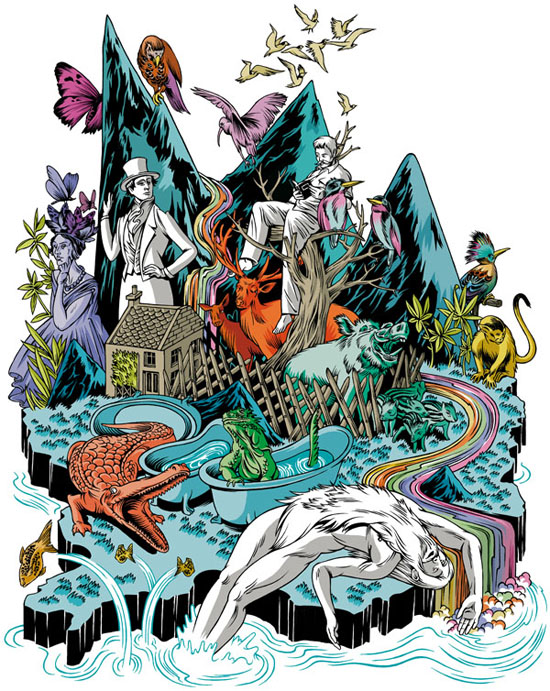
These ones below are some other layered nature illustrations. These ones I'm not so keen on. I don't really like how busy they are I feel they're really hard to look at. So many different colours and so many different animals, characters and plants. I also feel some of the colours don't really compliment eachother as well as they could.


I do however really like the busy layered nature illustrations that are done with the two tone colour scheme. I think it's just the combination of heavy colour and busy subject together that doesn't work quite so well.