

Jörn Kaspuhl
Jörn Kaspuhl is another illustrator I found from Illustration Now library book. He's a freelance illustrator that has worked for several internation agencies, magazines, publishers, musicians and fashion labels. The below image is an example of one of his work for Benevolent. The reason why I picked this one in particular to blog was because I really like the two tone colour scheme. The album is called "The Rain and the Sea" just from the title I felt he'd really represented it well. But I thought it would be a good idea to actually have a listen to the music itself to see how well he's captured it. It's an acoustic band whose vocals are really soft and the music is quite melancholy.
The cover has captured these elements nicely. By incorporating things such as the doves, the waves and the colour makes it visually appear quite soft and peaceful, Similar to the music. He's also Incorporated the clouds, the leaveless trees and the washed up boats which kind of portray a element of disruption and sadness. Which I think captures the album quite well. The songs seem to be quite deep and the title "The Rain and the Sea", makes me think of troubles, like 'troubled water' etc. but he's brought this idea together nicely with a rather peaceful element as well.

A lot of his work he likes to incorporate nature and animals and the interweaving of nature. The illustration below is another CD cover he's done. This is a great example of his animal illustration. A lot of his work is the unifying of animals and humans and this one below I really like. I think it's really interesting how he's layered the different birds among eachother in place of the mans hair. I also like how he's used simple black lines but filled areas in to add more definition. I didn't realise at first but even the right hand side is also birds in negative. I thought this looked really effective, as at first I thought it was hair, then saw the beaks and realised it was infact also birds.

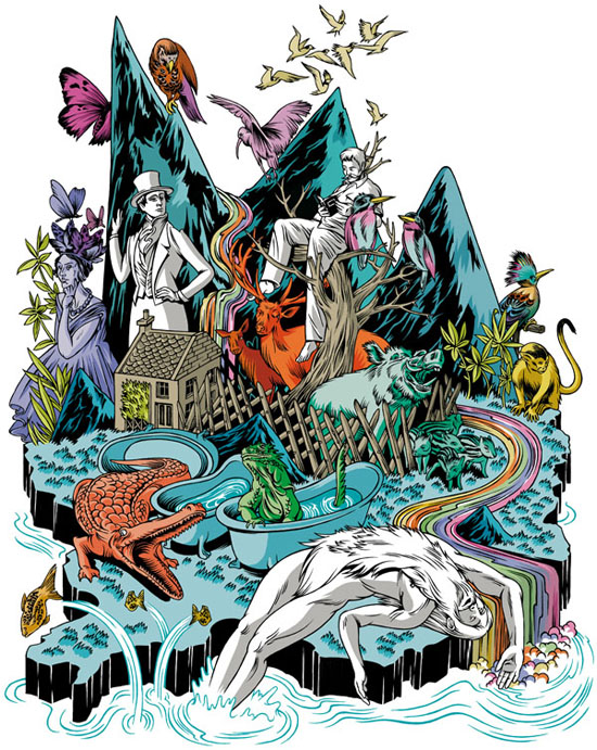
These ones below are some other layered nature illustrations. These ones I'm not so keen on. I don't really like how busy they are I feel they're really hard to look at. So many different colours and so many different animals, characters and plants. I also feel some of the colours don't really compliment eachother as well as they could.


No comments:
Post a Comment