


Wim Crouwel
Wim Crouwel is a dutch graphic designer and typographer. He is well know for the typeface "New Alphabet" which contains only horizontal and vertical lines.

Due to only using horizontal and vertical lines many of the letters are unconventional and some are hard to even read. Such as the a instead of altering the curved lines to make straight ones he's just not included them at all, making the letter a really quite hard to recognise as that letter. I find the letter K particularly unusual as it just looks like a T. But I guess that is why it's named "New Alphabet" this alphabet is not trying to be the same as the original alphabet.
.jpg)
The album Substance by joy division is an example of this font in use, after it had been altered slightly by Brett Wickens and Peter Saville . It's clear to see the font works really, when the letters are used in a word the word is still readable which is important in my opinion when it comes to typefaces. Yeah you can make it look unique and unusual but if it's not readable then ultimately it's not fulfilling it's purpose. Wim Crouwel himself was even quoted to say New Alphabet was ‘over-the-top and never meant to be really used’.
According to The Design Museum Wim Crouwel's typography captured the essence of the emerging computer and space age of the early 1960s. As they did have an exhibition for him in march last year. I think from New Alphabet you can see this inspiration.
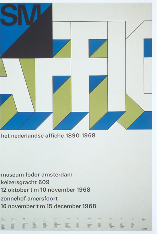
He did all of the design and posters for the Stedelijk Museum in Amsterdam also. These are some exampled below.

No comments:
Post a Comment